GB Advisors is a business consulting firm that helps organizations drive growth by leveraging AI-powered software solutions to design smarter and more efficient processes. As a Senior Brand Designer, I developed and launched a new brand identity, presenting design directions aligned with the company's AI-driven growth mission, while building a scalable design system in Figma to streamline cross-team collaboration.
The new identity came from a maturing market and a shift toward more experienced advisors. The previous identity was too playful, cluttered, and lacked clear guidelines, making it difficult to scale. It no longer reflected the brand's authority and reliability.
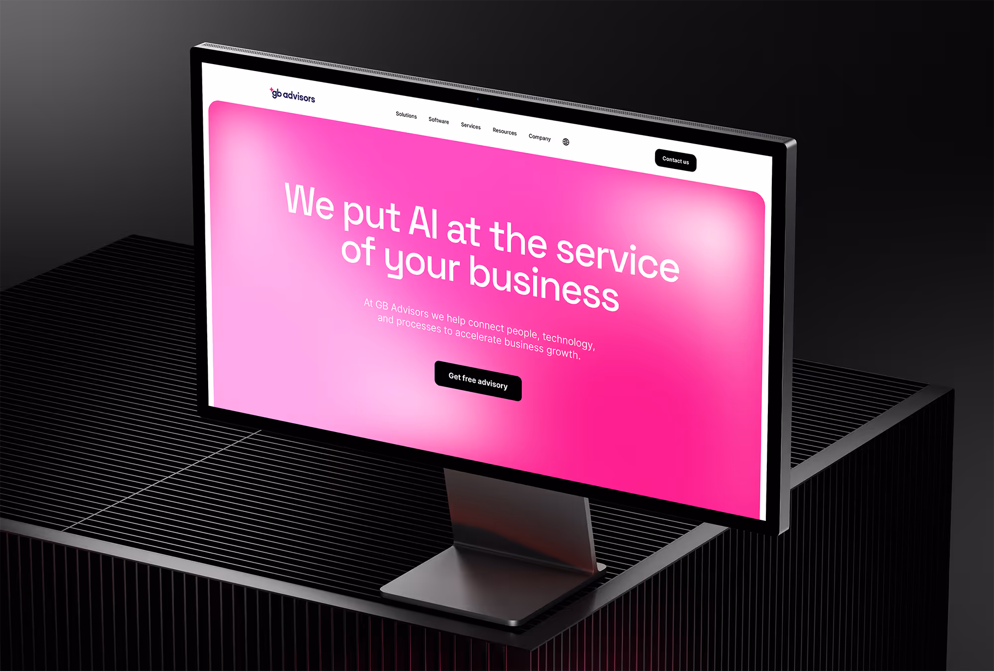
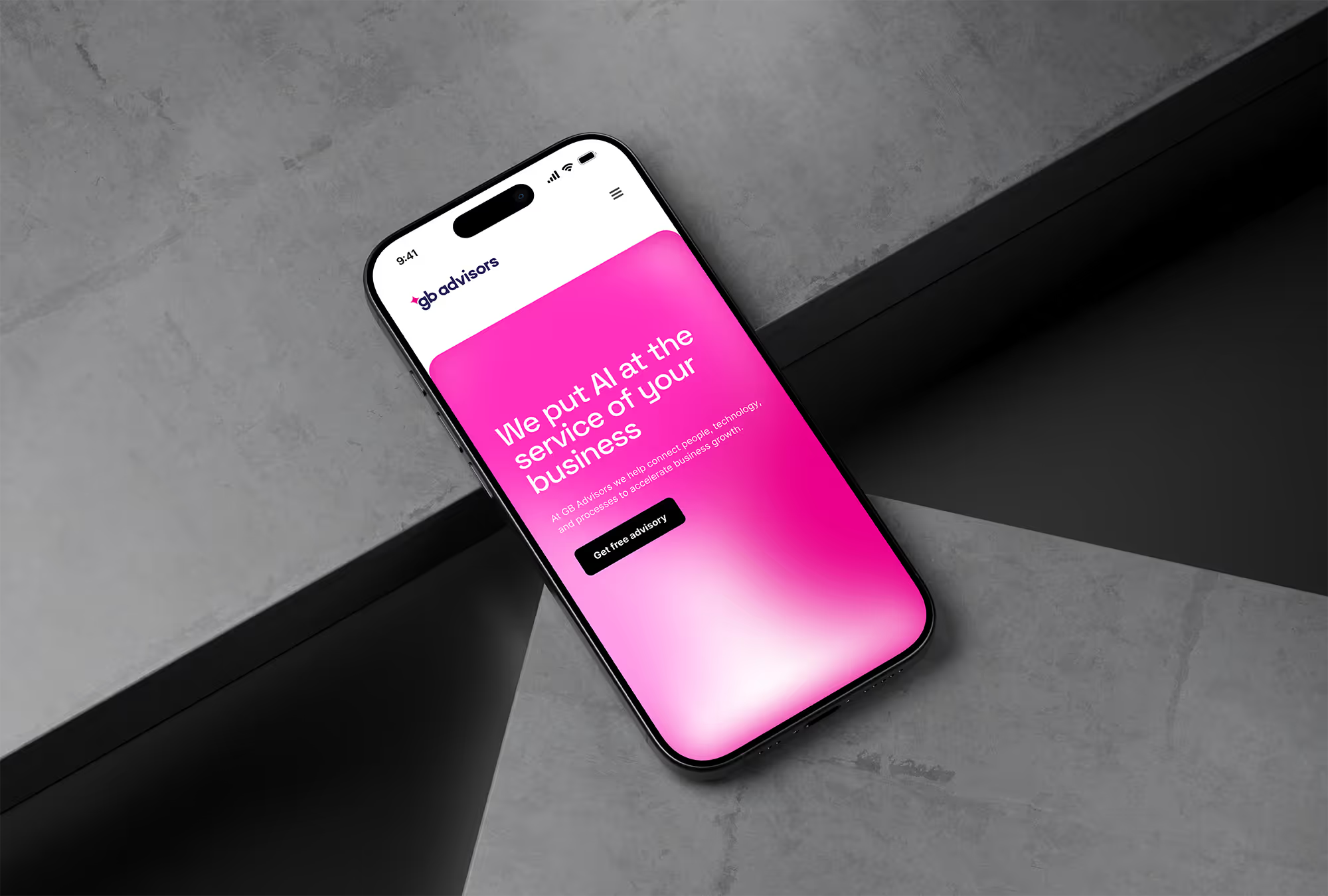
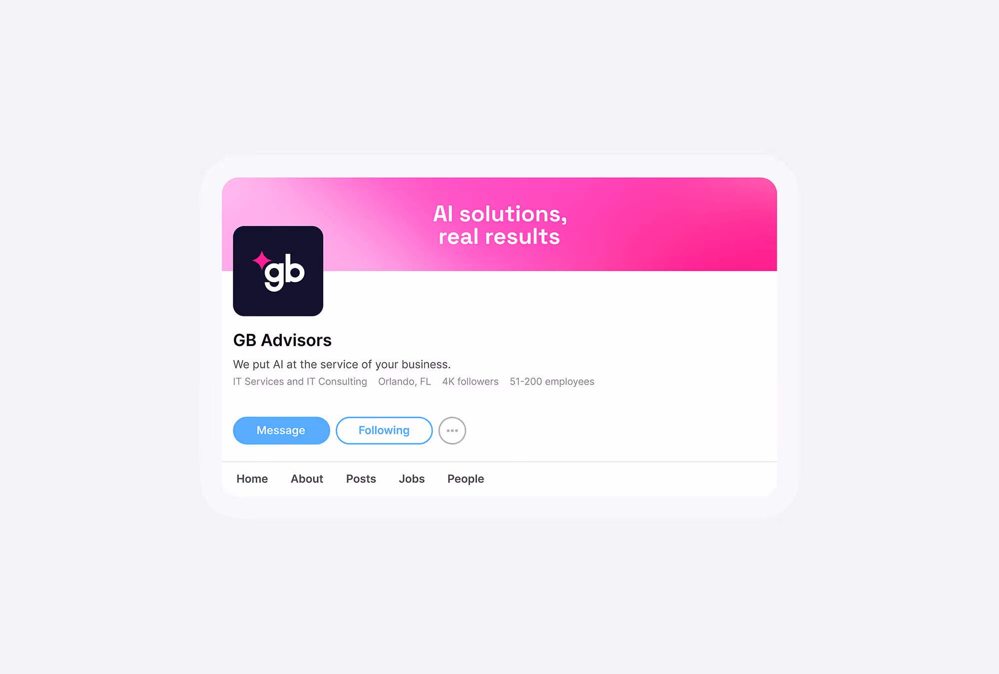
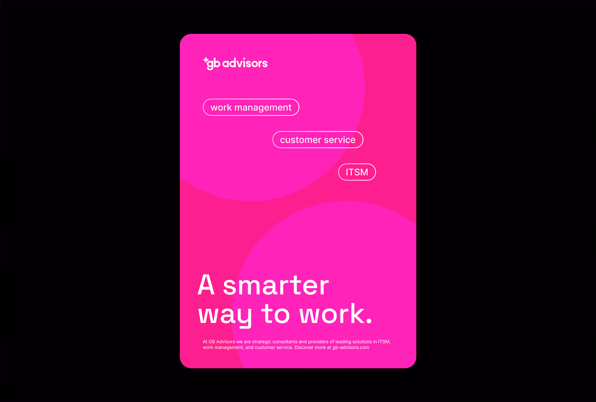
The new concept reimagined GB Advisors as strategic consultants and providers of leading SaaS solutions, combining professionalism and credibility with a bold AI-driven vibe. I built a consistent, scalable design system with templates, unified the visual language across multiple domains in 2 languages, and created comprehensive brand guidelines.
Art Direction
Brand Identity
Design Systems
2026
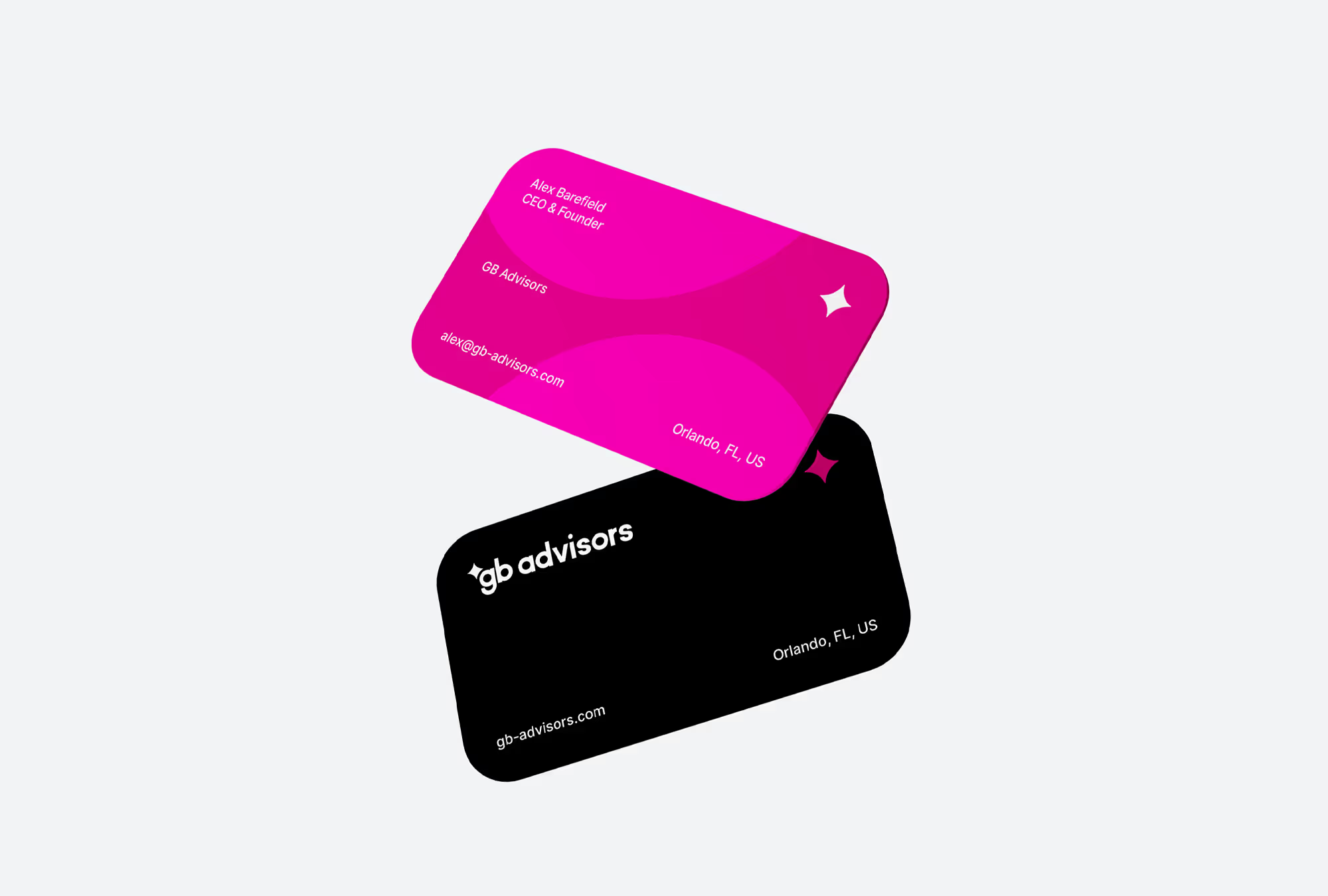
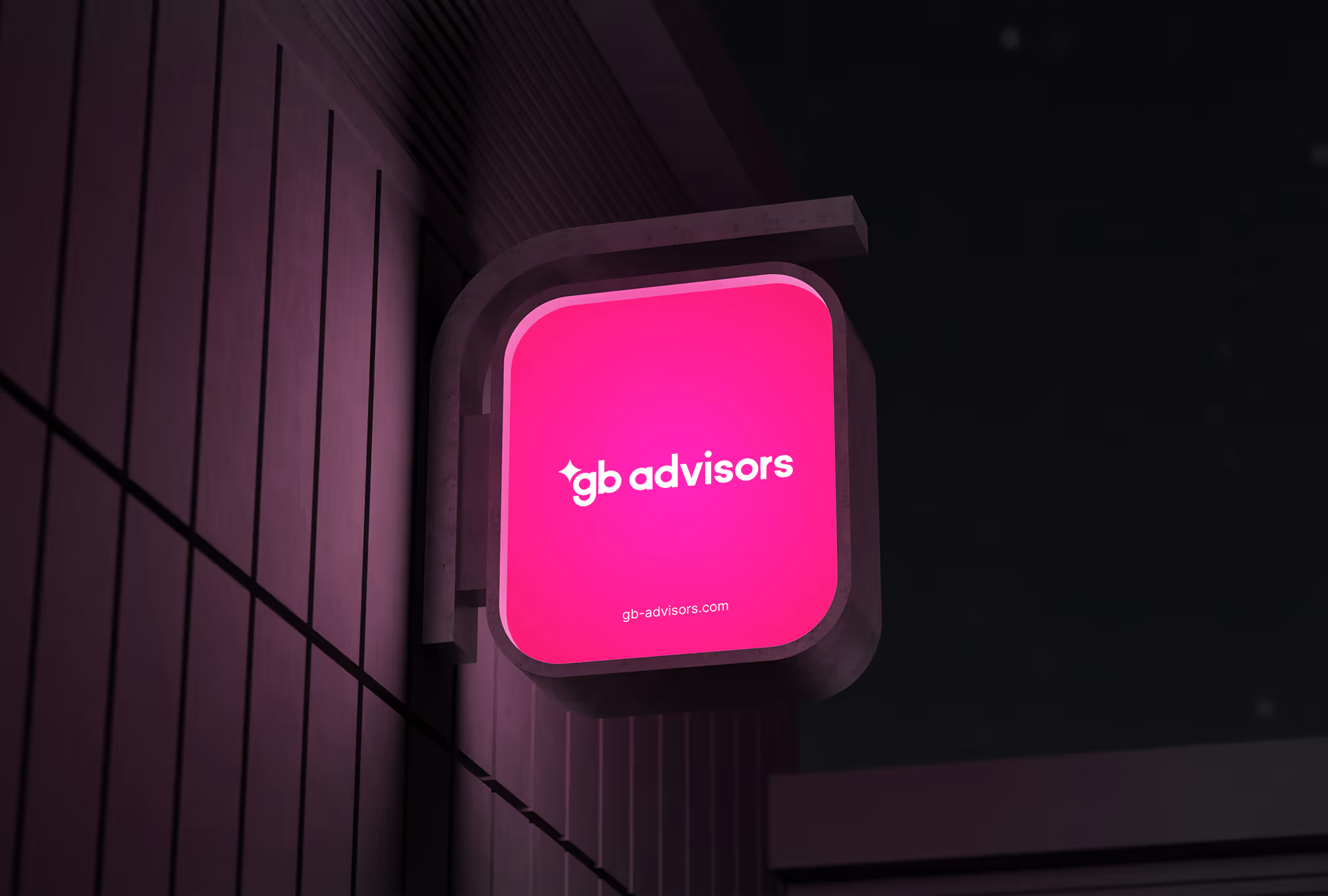
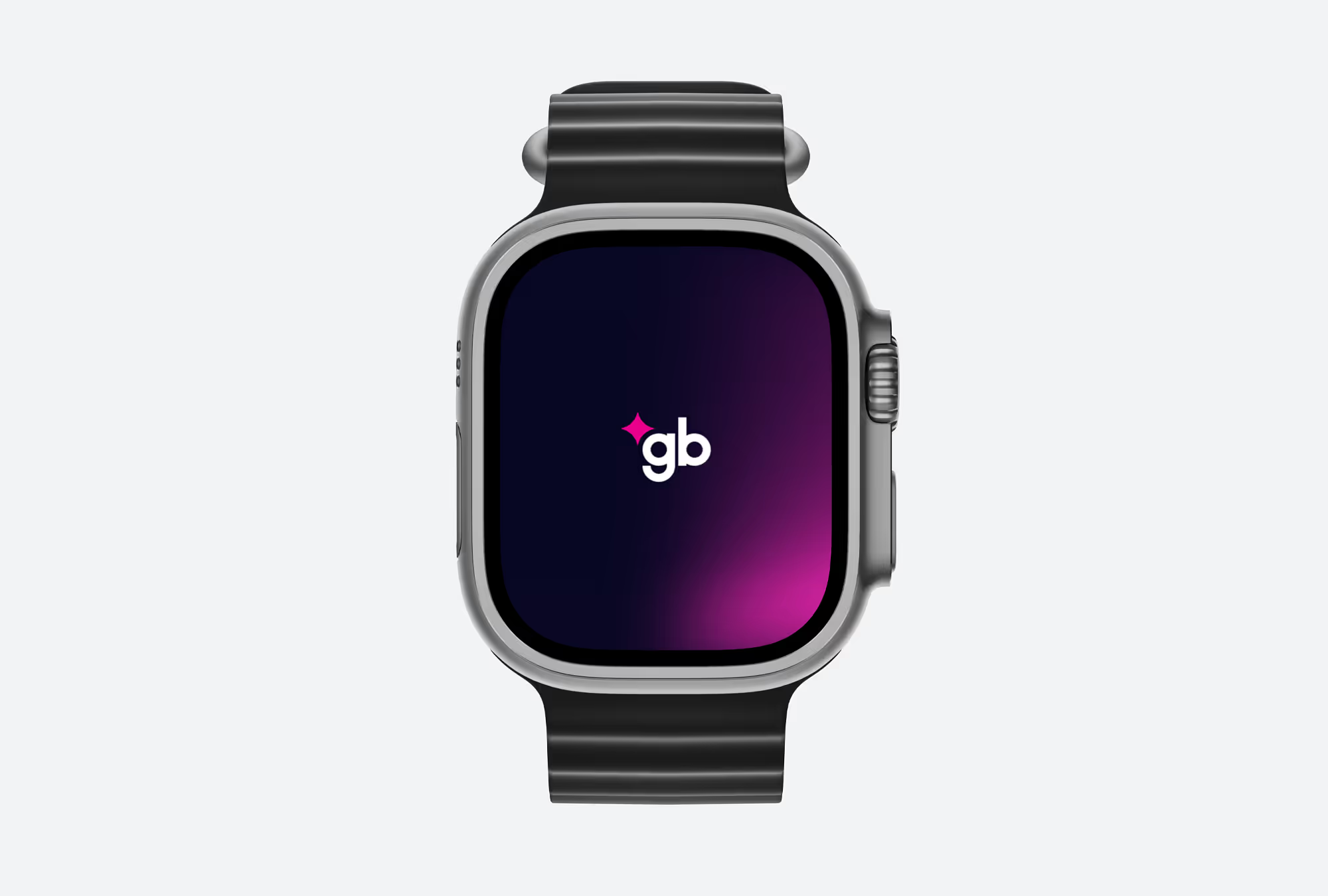
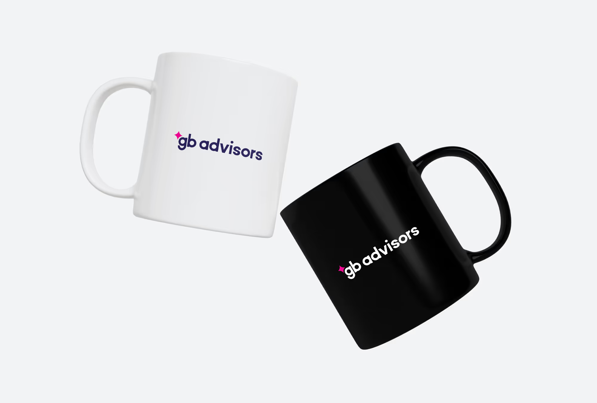
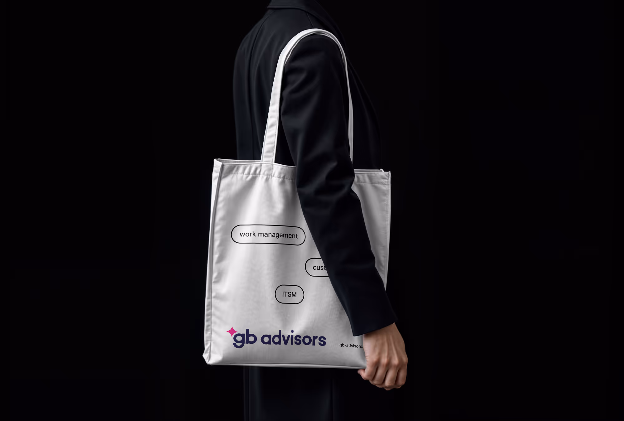
Driven by dynamism and passion for what we do, we have built our logo with a star symbol that represents innovation, accompanied by a typeface designed with convergent geometric shapes, stylized in lowercase to communicate modernism in a friendly way.
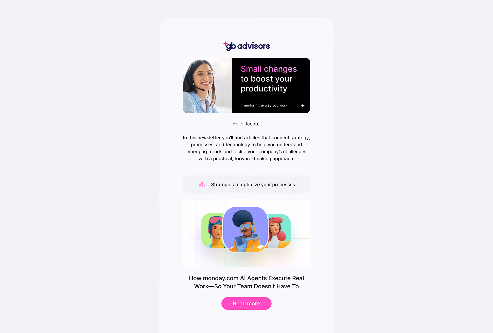
Space Grotesk is a modern sans-serif collection inspired by a clean and simple yet futuristic style. The family provides a wide range of weights and stylistic alternatives that can be mixed to create strong branding. Space Grotesk is used for headings.
Inter is a typeface carefully crafted & designed for computer screens. Inter features a tall x-height to aid in readability of mixed-case and lower-case text. Inter is used for all paragraphs and body texts as well as subheadings.
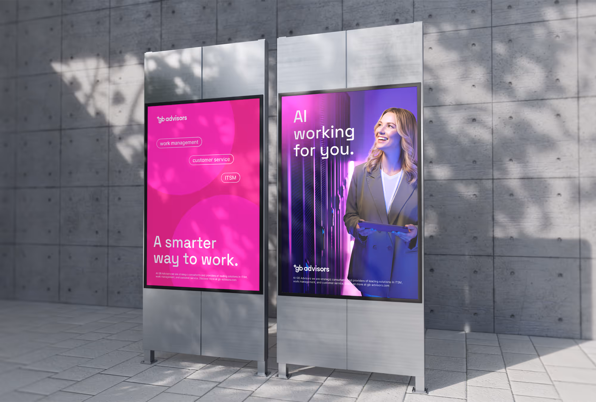
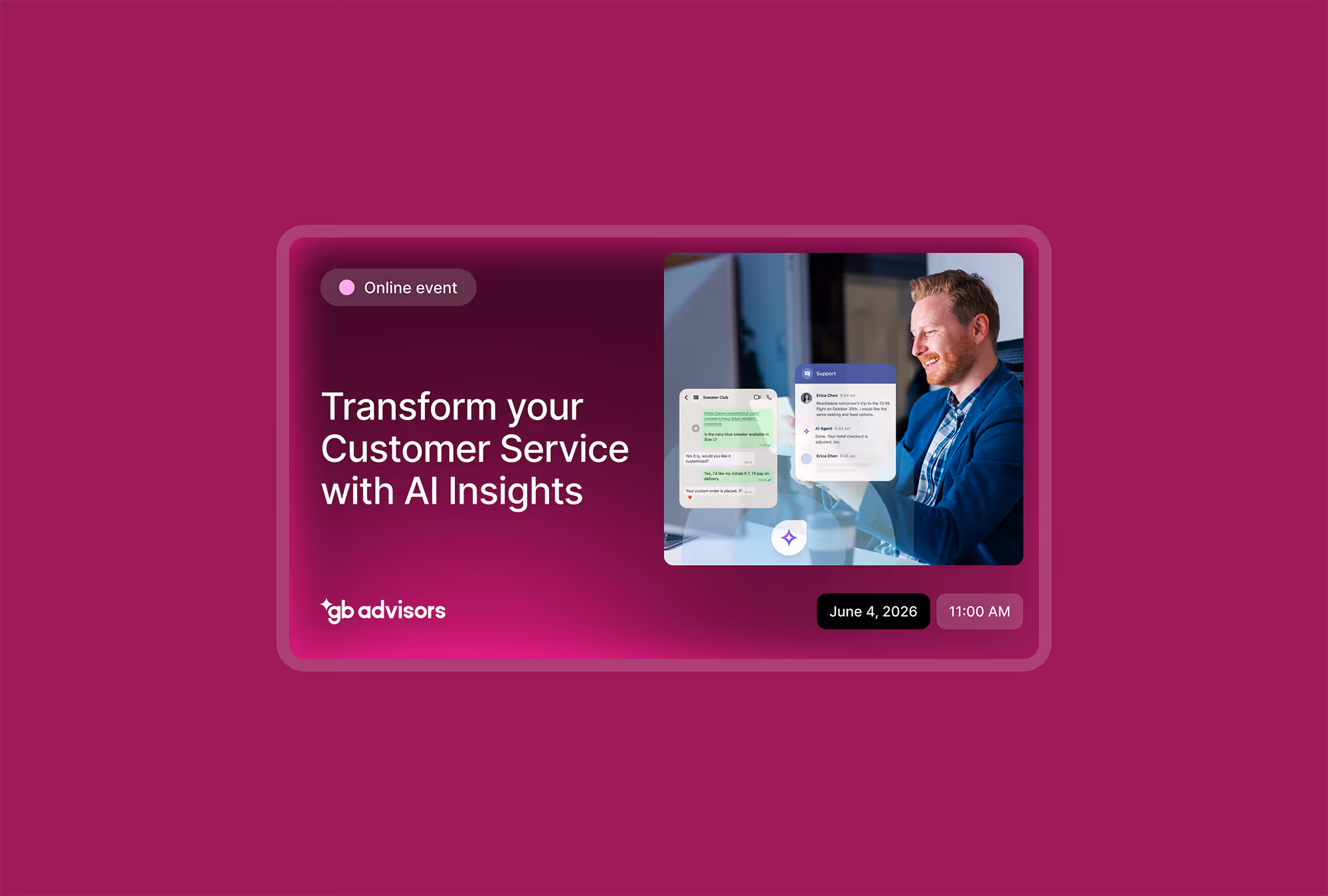
The primary brand color is bold magenta, which represents dynamism, transformation, and vibrant energy. The secondary brand color is tech purple, which stands for innovation, trust, and leadership.
The icons help creating supporting graphics and they are based on Google Material Symbols & Icons.
We will use photographs and videos that showcase technology and teamwork, keeping in mind that people are the primary focus.
Use the primary colors of the brand to create gradients.
We designed visual assets that interact with the audience across the web and other communication touchpoints, like G-Bit, the brand's mascot. It represents GB Advisors' culture of innovation and collaboration.
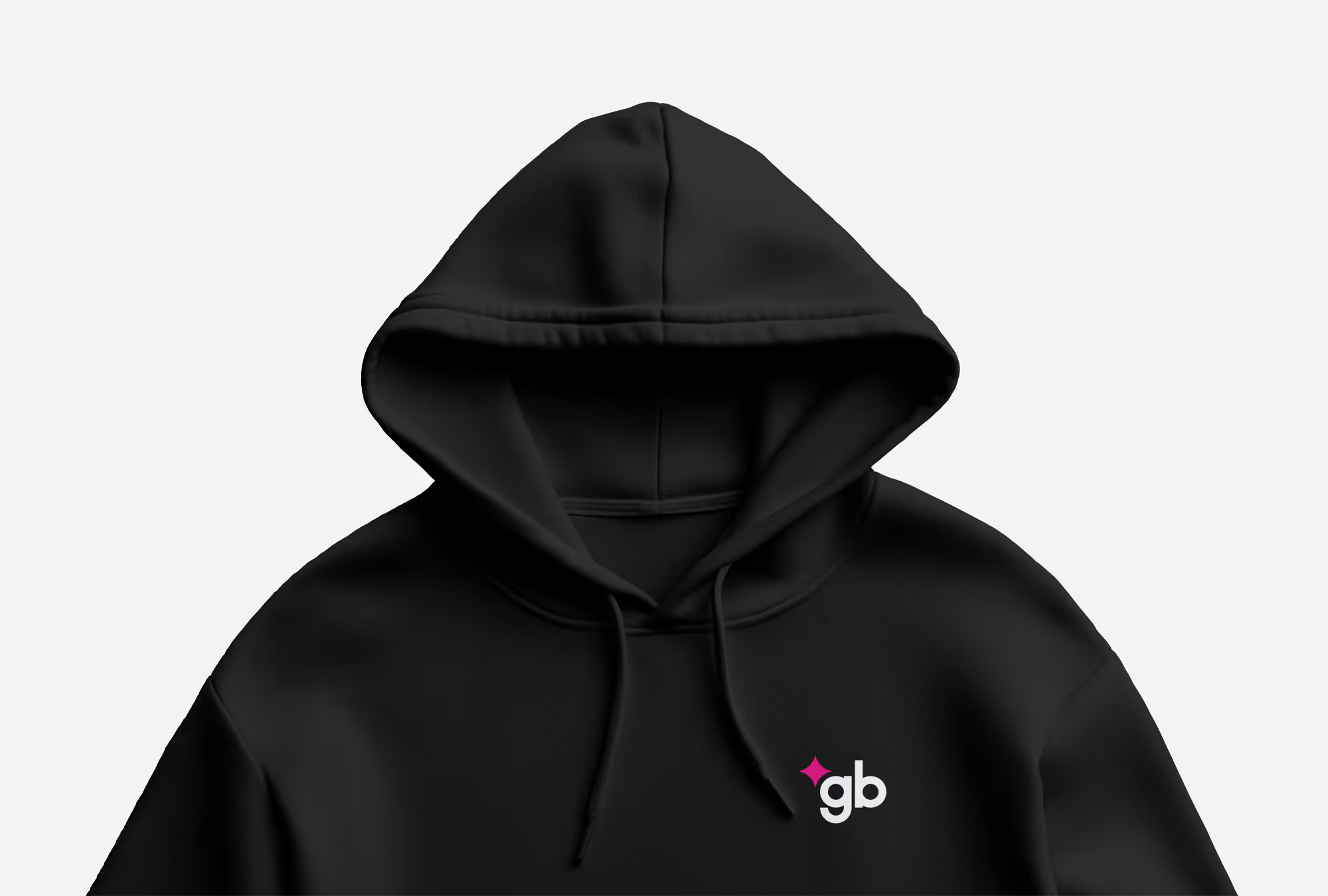
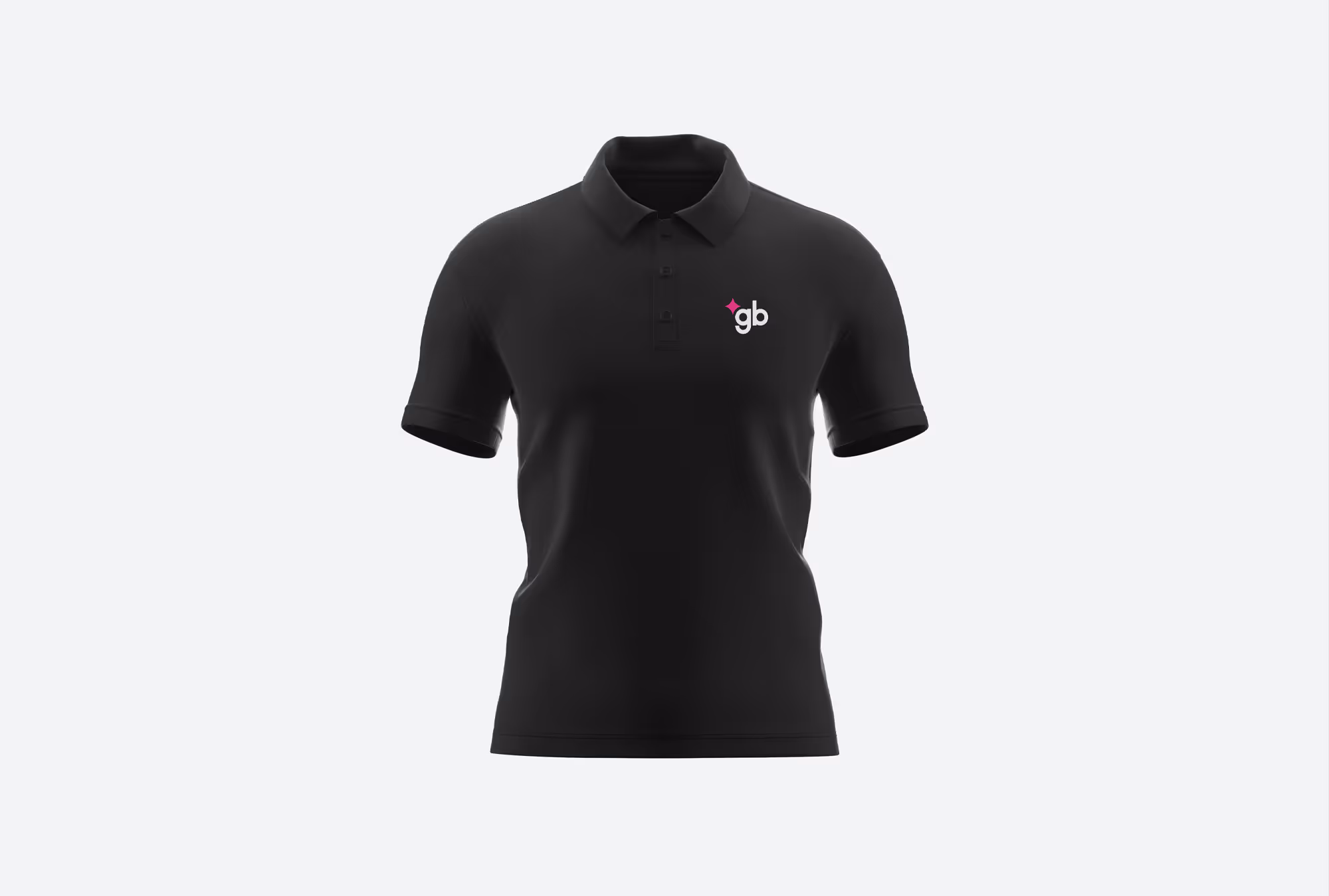
GB Advisors operation is mostly digital, but the brand is also present at conferences and workshops. To boost its presence, we developed branded merchandise for both internal and external use.
Edgar Arias
Edgar Arias
Andrea Hernández

